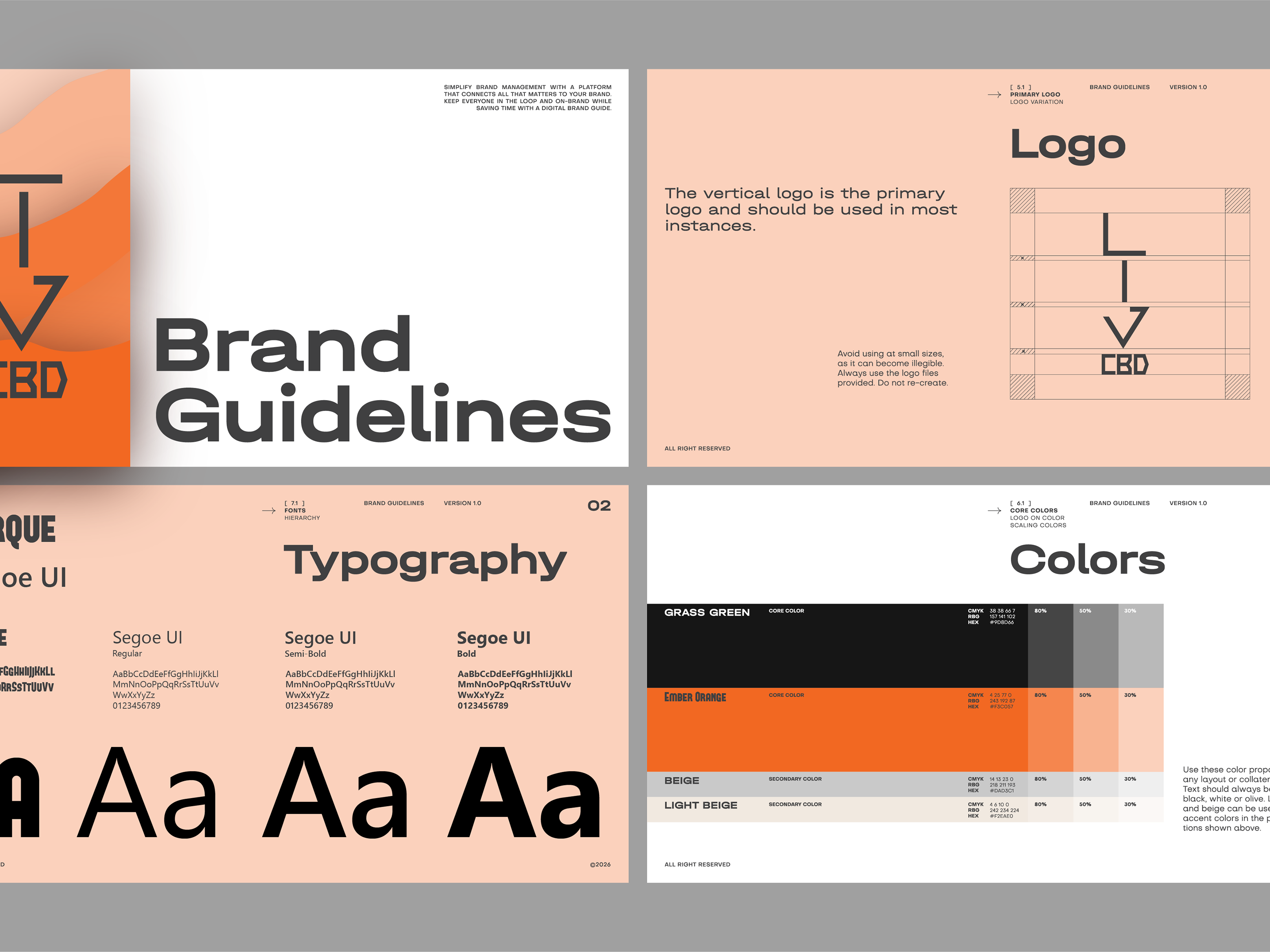
The logo design process started with a focus on simplicity and professionalism. I worked closely with Jacob to ensure the design captured the essence of his business.
A clean, geometric lightning bolt merged with an electrical plug, representing the core services they provide.
A modern combination of dark navy blue and bright yellow, symbolizing both professionalism and energy.
Strong, bold fonts to evoke trust and reliability, with subtle rounded edges to reflect the family-run nature of the business.
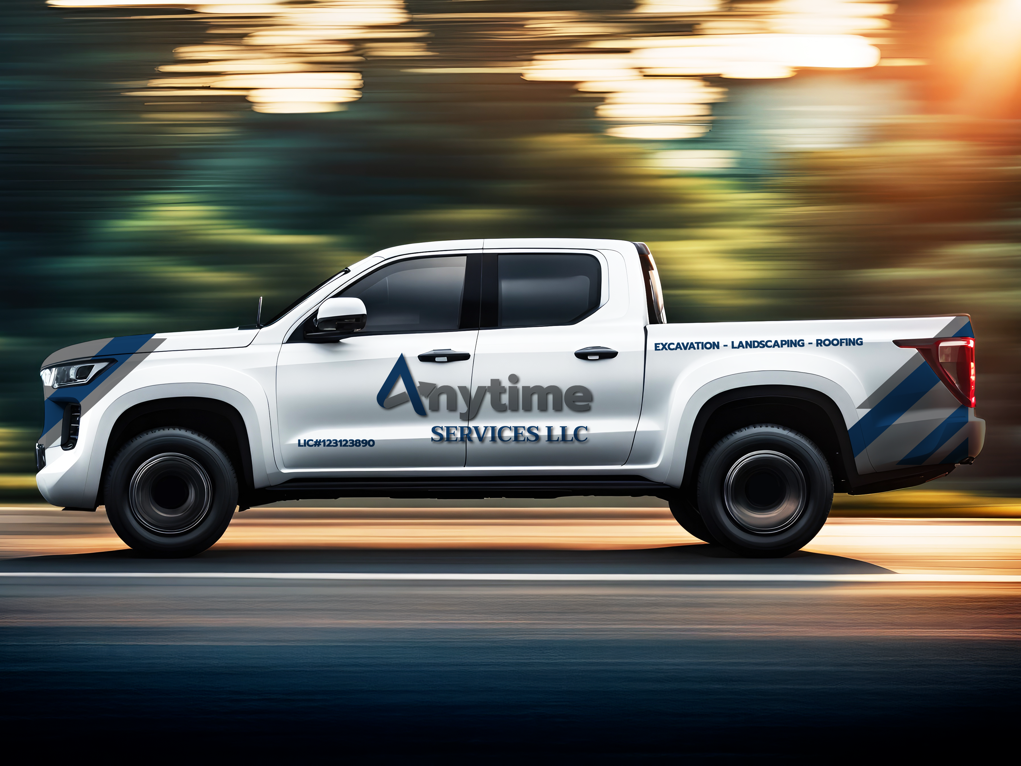
The final logo was versatile enough to be used across vehicles, uniforms, business cards, and online platforms, helping to solidify their visual identity in the community.

